In the evaluation the following seven questions must be addressed:
In what ways does your media product use, develop or challenge forms and conventions of real media products?
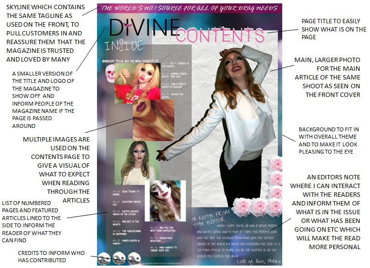
As you can see from the left image, I have tried to gather and incorporate as much of my research as possible into my work to make it fit into the conventions found previously. For example, on my front cover I have made the image overlap the title in order to show people that the magazine is so well known that we don't even have to show it fully in order to be recognised. It also connotes that the people (artists and readers) are more important to us than ourselves because they're the reason that we were able to create the magazine and keep producing more and more issues.
The convention I did challenge from real magazines was that they all have/had plain backgrounds on the main photos, whereas I decided on adding a background of colourful bokeh behind it to add a feeling of fantasy and art, and then added a layer of grey static over (with about 40% opacity on in order for it to show the colour through) as I thought that this would add a feeling of grunge over the smoothness which reminds me of Divine and John Waters, of whom had a very tattered aesthetic,though I did not go all the way to their aesthetic style as it would look like a cheap mockery if it were up to them.
 For the contents page I have also tried to stick as closely as possible to the conventions as before, such as by using multiple images on the page to add to the visual element of it and by adding an editors note to show the readers that I have them in mind when writing up and laying out the magazine elements which I think will make them feel thought of and appreciated for taking part in the magazine's journey, which will therefore make them feel part of the family and not want to leave.
To improve this page, I would add in Ciara's name once again and add a description of what it was about underneath her arm on the left, as this would tie everything up nicely and get rid of that gap in the middle.
This has also been applied to my double page spread as once again I
have kept to the same colour scheme and fonts as used previously and have added more images from the same shoot. I quite like the title of this one as I chose it to represent lipstick as if the title had been drawn on with it, which relates back to the overall theme of drag and makeup.
How does your media product represent particular social groups?
I think the main social group I have represented is definitely the drag lovers, as it provides them with something that they can read to be informed of who (in terms of the community, as portrayed on the list beforehand) is bringing out new music and when. I think from how I have set the magazine out, I have showed that they are all about colour and style as I have added elements of blue, purple, and pink as the main, base colours and then the basic black and white for any important details or shadowing, which lays everything out professionally and still sticks to the three main colours I chose earlier in my research.
I also think my magazine represents them as makeup and disguise lovers, as the cover model is wearing a lot of makeup to change and exaggerate all of her features, which portrays the social group to be very creative and visual. Hopefully they like my attempt and the style of it and they think that I did it justice.
In the contents, I have incorporated every page listed to do with the wonderful world of drag and have added photos beside some of the articles to attract people who love high quality photos of queens, such as photographers or artists in the market e.g. Magnus Hastings, Chad Sell, Garrett Matthew etc. as they have a very large following and so if they liked the magazine a lot then they could recommend it to their fans, thus creating a larger audience for 'Divine'.
What kind of media institution might distribute your media product and why?
I think out of the four major magazine institutions - BBC, Emap, IPC Media and Bauer - IPC Media is the one that is most likely to distribute my media product.
"IPC Media is one of the leading of both consumer magazine and digital publishers in the United Kingdom. It was formed in 1963 as International Publishing Company and currently produces over 60 iconic media brands, with print alone reaching almost two thirds of UK women and 42% of UK men – almost 26 million UK adults –their websites collectively reach over 14 million users every month.IPC is owned by Time Inc, the publishing company of Time Warner Inc. The company has many sub-brands within their portfolio such as: IPC Media Connect, Market Force, Southbank, Ignite, and TX. The iconic music magazine brand that IPC Media is well known for is New Musical Express (NME) which was first published in March 1952 and will be celebrating 50 years in the music industry in 2012. It was the very first British paper to include a singles chart. Their genre is advertised as rock which would therefore attract a wide audience of both mixed age, gender and target groups such as rockers, punks, and new age groups. The types of musicians they include are Kings of Leon, The Killers, Arcade Fire and Artic Monkeys. NME has become a truly unique multi-platform media proposition. Across the magazine, nme.com, NMETV, NME Radio and the brand's live events and awards, NME reaches over one million music fans every week. NME is the longest published and most respected music weekly in the world. Every week it gives its readers the most exciting, most authoritative coverage of the very best in contemporary music, including award winning features, the latest releases, live reviews, the definitive guide to the best new bands in its Radar section, as well as a regular look back through the magazine's incredible 58 year heritage."
I believe that this institution is more likely to be interested in distributing my magazine as they have a very large market and therefore the only way to guarantee more income and interest is to fill a niche market. Drag being a very loving and larger-than-you-think niche market of which the institution will benefit largely from.
Who would be the audience for your media product?
My audience is for mainly people aged between the ages of 16-21 as these are the ages where discovery is prominent in our minds and when we want to know everything that is going on within the world we love. My audience is very respectful and open minded and so gender boundaries simply don't exist in this subculture, therefore the audience gender-wise is simply non-existent as it's for absolutely everyone. Group-wise the magazine is for those a part of the LGBT+ community and those alike whom simply enjoy the world of drag.
How did you attract/address your audience?
I attracted my audience by presenting them with a lot of design work on the magazine, making sure everything was related to big people in the music industry of drag and making sure that they were going to be interesting and fun reads. For example, the story labeled as 'Jeffree Star Cosmetics launch' attracts everyone interested in not only makeup itself, but makeup artists alike and from reading this they will get that the article will be about Jeffree himself, his new makeup line including reviews and photographs, and because Jeffree is a music artist signed with popsicle music as well as a makeup artist it may contain his music updates too. This shows that the magazine will cross into the realms of every art aspect of the music artists and there will be interesting stories for all.
What have you learnt about technologies from the process of constructing this product?
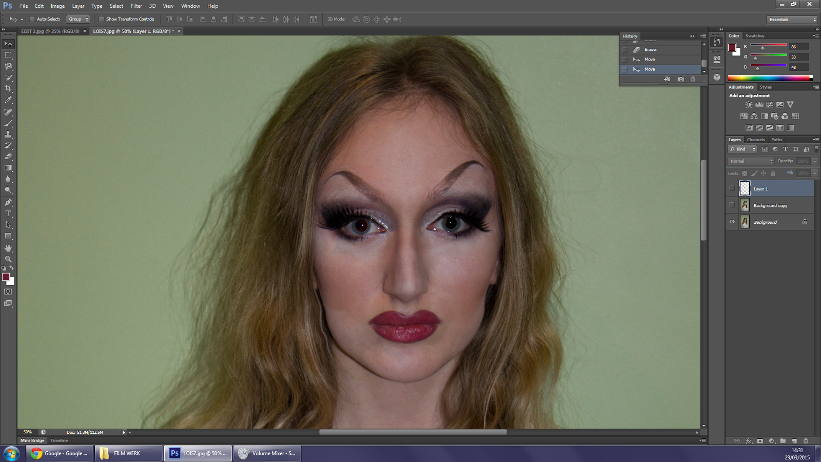
Process of editing, in order of beginning to end/before and after:
Looking back at your preliminary task, what do you feel you have learnt in the progression from it to the full product?
From above, I see that from my preliminary task that I have put so much more effort into the music magazine than the college magazine, as there was so much more put into it, such as the time, effort and research of conventions, history and the industry. At the start, I did not know a thing about photoshop apart from where the lasso select tool was because I'd used that before, but now I know a lot more about it and where the components and symbols are and what they mean/do. This helped me create much more layers of depth and detail to make it look fun and well-designed, such as that for every layer I used the magic wand selection tool to select the background and then invert the selection so that Lois was the only thing selected, and then selecting the layer of background I wanted shaping, I'd click delete and then erase any extra background that was showing over due to it being missed by the wand.
I have to say that it's quite amusing yet satisfying to see the two together, as they both started off in the same way: as a white background and Lois. And, although to me the magazine does not look the mot realistic in the bunch, I have learned so much during the journey to do with different technologies and programs, the business aspect, and the design aspect too and it has been a really fun and enlightening experience.
Comparing my magazines, you can see even from the smaller aspects of how my design idea has changed, such as the plug is so much more better advertised in the music magazine as is in it's own background to make it easier to see and attract it's customers, as in the college magazine I just used the same colours and fonts of which are really boring and hard to find and also does not include a logo to visually recognise the brand straight away.
I also made Lois' (Ciara's) name much bigger on the music magazine to make it easily seen from the shelves so that if you're just passing by the magazine rack you can still catch the name from a quick glance, pulling potential customers in.


